3E Protect Redesign

Transforming a compliance platform buried in design debt into a human-centered product users actually want to use
UX Research | Information Architecture | Interaction Design | Wireframing & Prototyping | B2B SaaS
Solo Lead Designer
first dedicated UX hire at 3E Company
11,000
users researched across 12 product lines via SQL extraction
2
core personasManager Mary + International Ivan

Before After
01 / Overview
3E Protect is a comprehensive B2B SaaS platform that helps businesses manage compliance with safety data sheets (SDS), labels, and regulatory requirements — critical infrastructure for companies operating in hazardous materials, manufacturing, and global supply chains.
When I joined 3E Company as their first dedicated product designer, 3E Protect had been built entirely by engineers without design involvement. The accumulated design debt was significant — usability issues, visual incoherence, barriers to user adoption, and a product that users found difficult to trust. My role was to redesign the platform from the ground up, starting with research and ending with a validated MVP ready for engineering implementation.
The platform had never had a designer. Every usability problem, every confusing navigation path, every piece of visual inconsistency — it had all accumulated over years of engineering-led development. My job was to untangle all of it and build something users could actually rely on.
My role
First and only product designer on the 3E Protect redesign. End-to-end ownership from initial research through final prototypes — user research, competitive analysis, personas, information architecture, interaction design, wireframing, and prototyping.
02 / The Problem
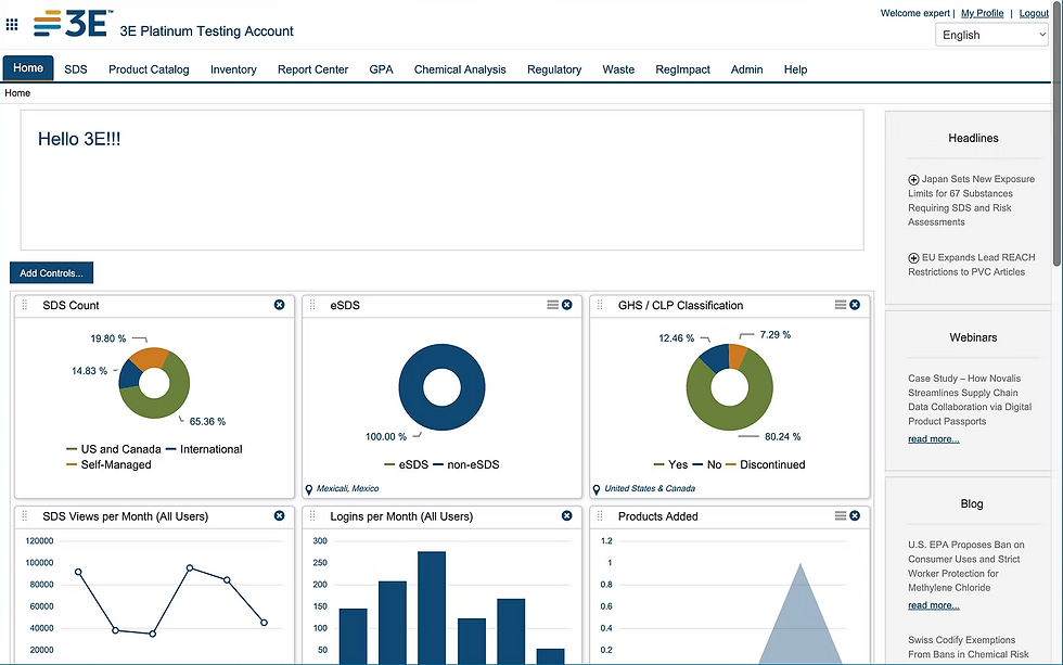
3E Protect had a compounding problem. On the surface, it was design debt — inconsistent UI, unclear navigation, confusing workflows. But underneath that was a deeper issue: no one had ever talked to users. There was no user database, no research history, no data about how people actually used the product or what they needed from it.
The technical debt and design debt were intertwined. Before meaningful design progress could be made, the engineering team needed to address technical constraints. This created an unusual challenge: designing for a future state of the product while working within the limitations of its present state.
The specific pain points
No designer had ever been involved in the product's development — all UI decisions had been made by engineers
Significant visual incoherence across the platform from years of incremental additions
Navigation was complex and counterintuitive, making core tasks — searching SDSs, creating labels, managing compliance — unnecessarily difficult
The platform served a global user base but had no accessibility considerations and no multilingual support
Users had no centralized dashboard — no single place to understand their team's status or pending actions
Communication between the platform and its users was minimal and unclear
The real challenge
The biggest obstacle wasn't designing a better UI. It was that no user research infrastructure existed at all. Before I could design anything, I had to build the foundation for understanding who I was designing for.
03 / User Research — Building the Foundation
Since this was the first formal user research effort at 3E Company, I kept my initial goals deliberately broad. I wanted to understand user behavior, pain points, expectations, and desired improvements — not just for 3E Protect, but in a way that would be useful across the company's entire product suite.
Building the user database from scratch
The first obstacle was access. There was no way to reach users — no contact list, no research panel, no existing relationship between the company and its customers outside of sales and support interactions.
I took the initiative to solve this myself. Using SQL, I extracted data from 11,000 users across 12 product lines — building a comprehensive user database from scratch that became a research asset not just for my work, but for the entire company. This was foundational infrastructure that had never existed before.
The initiative
Creating that user database wasn't in my job description. But without it, no meaningful research was possible. Building it was the difference between designing based on assumptions and designing based on evidence.
Research methods
In-depth stakeholder interviews — internal stakeholders across product, engineering, sales, and compliance
Customer interviews — direct conversations with users to understand their workflows, pain points, and mental models
Surveys — distributed to the user database to gather quantitative behavioral data at scale
Usability testing — task-based testing of existing workflows to identify specific friction points
Google Analytics implementation — I implemented GA to gather quantitative data on usage patterns, user behavior, and areas of drop-off
Key insights
Five clear themes emerged from the research:
Users didn't trust the data. They questioned whether 3E Protect was providing the most current and accurate SDS information — and in a compliance context, that distrust had serious consequences
As a global product, the platform needed to be accessible to users across languages, regions, and regulatory environments. This was a gap that was affecting real users every day
Core tasks — searching for SDSs, creating labels, managing team compliance — required too many steps and too much cognitive load to complete efficiently
The navigation was too complex and too deep. Users couldn't find what they needed without significant effort
Users felt disconnected from the platform. When things changed or actions were required, they often didn't know until it was too late
04 / Competitive Analysis
I conducted a thorough competitive analysis of the SDS and compliance management landscape to understand how 3E Protect sat within the market and where opportunities existed to differentiate.
The most significant finding came from analyzing UL-Wercs, 3E Protect's primary competitor. UL-Wercs differentiated itself by giving users a high degree of flexibility and customization in creating safety cards and labels — a capability that 3E Protect lacked. Users who needed to tailor their compliance materials to specific organizational or regulatory requirements were underserved.
The competitive insight
The competitive insight wasn't just “add more features.” It was about giving users agency — the ability to customize and control their compliance workflow rather than being constrained by a rigid system.
This finding directly shaped the redesign direction. Rather than simply improving the existing feature set, I incorporated greater customization capability as a strategic design priority — positioning 3E Protect to match the flexibility of its main competitor while significantly improving the overall usability and trust that UL-Wercs lacked.
05 / User Personas — Manager Mary & International Ivan
Using the key insights from research, I built two primary personas that captured the distinct user needs, contexts, and frustrations surfaced in interviews and surveys.
Manager Mary
“Though some SDSs are up to date, I still feel most comfortable going to the manufacturer to get the most recent SDS. I am starting to worry if 3E Protect is providing me the best information — and I am concerned about what would happen in an emergency.”
Manager Mary represents the compliance-responsible manager at a mid-size company. Her primary concern is trust — she needs to be confident that the data she's relying on is current, accurate, and defensible in an emergency. She manages a team and needs visibility into their compliance status. She is not a technical user and needs a platform that gives her confidence, not anxiety.
International Ivan
“I am part of a multi-lingual company. I need to have access to information in my team's language. In order to fulfill our legal requirement, it is necessary to have all regulations that correspond to our country. I don't want to dig through regulations and documents unrelated to us.”
International Ivan represents the global user — operating across languages, regulatory jurisdictions, and compliance frameworks that vary by country. His core frustration is irrelevance: he's forced to navigate through regulations and documentation that don't apply to him to find the ones that do. He needs a platform that understands his regional context and surfaces only what's relevant.
Together, Manager Mary and International Ivan captured the two most critical dimensions of the user base: domestic compliance management and global regulatory complexity. Every design decision in the redesign was evaluated against both personas.
TrustManager Mary's core needaccurate, current, reliable data
RelevanceInternational Ivan's core needregion-specific, language-appropriate content
Bothshared needstreamlined workflows, clear communication
06 / Information Architecture
The existing information architecture of 3E Protect had grown organically through multiple business acquisitions — each adding features and navigation paths without a coherent overall structure. The result was a platform that felt like several different products loosely stitched together.
My challenge was to rationalize this complexity into a structure that felt intuitive to both Manager Mary and International Ivan, while acknowledging a practical constraint: some functionality would eventually be moved into separate products as part of a larger MVP consolidation effort. I had to design for the right now while building toward a cleaner future state.
The IA principles I established
Primary tasks first — searching SDSs, creating labels, and managing safety cards needed to be immediately accessible, never buried
Progressive disclosure — advanced functionality and less-used features moved deeper into the navigation, reducing cognitive load for most users
Role-aware structure — the architecture needed to surface different information and actions depending on whether you were a manager or an individual contributor
Region as a first-class filter — for International Ivan, regional and language context needed to be a primary organizing principle, not an afterthought
The dashboard redesign
One of the most impactful structural decisions was introducing a centralized dashboard. Neither Manager Mary nor International Ivan had a home base in the existing product — they landed on a generic screen with no personalization or context.
I redesigned the entry point as a true command center: team status at a glance, pending compliance actions, relevant industry news, and quick access to primary tasks. This single change addressed multiple research insights simultaneously — improving trust through visibility, reducing the time to complete core tasks, and giving managers the oversight capability they needed.
07 / Flow & Interaction Design
With the architecture established, I moved into flow and interaction design — mapping the specific sequences of steps users would take to complete their most important tasks and ensuring those sequences worked for both primary personas.
For Manager Mary — visibility and team communication
Manager Mary's core workflow need was team oversight. I designed a communication and activity layer within the dashboard that gave her real-time visibility into her team's compliance status — who had completed required training, which SDSs were flagged for review, and where action was needed.
Notifications and alerts were redesigned to be proactive and specific rather than generic, ensuring she was informed before problems became urgent.
For International Ivan — region-first navigation
International Ivan's core workflow need was relevance filtering. I redesigned the regulatory browsing and SDS search flows to treat region and language as primary filters — surfaced at the top of every relevant workflow rather than buried in settings.
When Ivan entered the platform, his regional context was immediately applied, and cross-regional content was clearly labeled and separated from his relevant results. This eliminated the noise that had been making his job significantly harder than it needed to be.
Good interaction design for a compliance platform isn't about clever interactions. It's about eliminating the moments of uncertainty — the “is this right?” questions that slow users down and erode their trust in the system.
08 / Wireframing & Prototyping
I took an iterative, collaborative approach to wireframing and prototyping — treating each round of feedback as design data rather than revision requests.
The process
Low-fidelity wireframes — rapid sketches and lo-fi digital wireframes to establish structural decisions quickly without investing in visual polish
Stakeholder reviews — early and frequent reviews with product, engineering, sales, and compliance stakeholders to pressure-test the architecture and flows against real business constraints
Mid-fidelity wireframes — more detailed representations that could be tested with users, showing layout, hierarchy, and interaction patterns without full visual design
User testing sessions — structured usability testing with actual customers to validate that the redesigned flows actually worked for Manager Mary and International Ivan in practice
Iterative refinement — each round of testing produced specific findings that fed directly into the next iteration
What the iteration revealed
Several assumptions I had made in the initial wireframes didn't survive contact with real users. The dashboard layout needed to be more customizable than I had initially designed — Manager Mary in particular wanted control over which widgets she saw and in what order. International Ivan's region filter needed to persist across sessions, not reset on each login — a behavioral pattern I wouldn't have discovered without testing. These findings strengthened the final prototype significantly.
The agile advantage
Working in tight iteration loops with both stakeholders and users meant that by the time we reached the final prototype, every major design decision had been validated at least once with real input. The MVP wasn't a guess — it was a product shaped by the people who would use it.
09 / Outcomes & Impact
The 3E Protect redesign delivered a validated MVP ready for engineering implementation — the first version of the product shaped by evidence rather than assumption.
What the redesign achieved
First user research program at 3E Company — the SQL-extracted user database I built became a shared resource used for research across the company's full product suite, not just 3E Protect
Evidence-based design foundation — every major design decision in the MVP was validated through user research, competitive analysis, or usability testing
Resolved the core trust issue — by redesigning data presentation and communication to be proactive and specific, Manager Mary's primary anxiety about data accuracy was directly addressed
Region-first architecture for global users — International Ivan's need for relevant, region-specific content was built into the structural foundation of the platform, not bolted on as an afterthought
Centralized dashboard — replaced a generic landing screen with a role-aware command center giving managers real-time team visibility
Reduced navigation complexity — condensed a sprawling information architecture into a streamlined structure focused on the three primary tasks
The longer-term impact
Beyond the immediate redesign, the user research infrastructure I built changed how 3E Company thought about design and user input. By demonstrating that talking to users produced better outcomes, I helped establish design as a strategic discipline rather than a surface-level function. That shift — from design as decoration to design as decision-making — was the most meaningful outcome of this project.
11,000users in research databasebuilt from zero using SQL
5core insightsthat shaped every design decision
2validated personastested against real user behavior
10 / Reflection
The 3E Protect redesign taught me something I carry into every project: the most important design work is often the work that happens before any design work begins. Building the user database, establishing research processes, and creating the personas weren't design deliverables in the traditional sense — but without them, nothing that followed would have been grounded in reality.
The technical debt constraint was a genuinely difficult design challenge. Designing for a future state of the product while working within present limitations requires a kind of strategic patience — you have to know which decisions can be made now and which ones need to wait for engineering to clear the path. Learning to communicate that nuance to stakeholders, and to design in a way that stayed useful regardless of which technical path engineering took, was some of the most complex professional thinking I've done.
If I were starting this project over, I would establish the usability testing program even earlier — before finalizing the information architecture rather than after. Some of the navigation assumptions that didn't survive testing were baked into the IA before I had real user data to challenge them. Earlier testing would have surfaced those issues sooner and saved iterations downstream.
The most rewarding part of this project was watching the company's relationship with user research change. By the end of the project, stakeholders who had never thought about users in a structured way were asking to be included in research sessions. That cultural shift — design opening a door that stayed open — is the thing I'm most proud of.


Comments